Often I am asked to shrink the SharePoint 2013 suite bar and ribbon into one line. For some, the suite bar and ribbon take up too much space and thus the desire to collapse the two bars into one. This is actually very easy to do with a little CSS and jQuery.
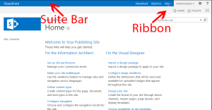 Unsure of what I mean by the SharePoint 2013 suite bar and ribbon? Check out the image to the right.
First, what do I mean by shrink? The common request is to somehow combine the suite bar and ribbon into one line. The current release of SPO actually does this for us, but with on-premises, we need to provide our own customizations.
The suite bar is new to SharePoint 2013 and includes the top left title or message (i.e. “SharePoint) and links on the right. The right links include the Suite Links, the Welcome Menu, the new Site Actions “gear” and finally Help. The ribbon is beneath all of this and includes most of what our ribbon had in SharePoint 2010.
I prefer to combine these two bars by taking the elements of the suite bar and moving them into the ribbon. I do this primarily because the ribbon includes more dynamic features such as tools used to edit a page. The ribbon will expand and collapse on its own depending on the current state of a page and I like to leave that alone.
Further, I prefer to use jQuery and CSS instead of making major changes to the ribbon in a custom Master Page as I would rather keep things simple and not mess with SharePoint’s ribbon controls. Therefore my strategy is to hide the suite bar using CSS and use a little jQuery to move specific elements from the suite bar to the ribbon.
The Code:
I created a custom master page by making a copy of seattle.html, but you could use any custom master page. I then also created a custom CSS and custom JS file. You could add the CSS and JS directly inline in your custom master page, but I prefer to place these types of customization into their own files.
My custom CSS file includes the following CSS. Comments are inline but essentially I am hiding the suite bar and then providing new styling to make sure all of my suite bar components look ok when moved to the ribbon.
1 2 3 4 5 6 7 8 9 10 11 12 13 14 15 16 17 18 19 20 21 22 23 24 25 26 27 28 29 30 31 32 33 34 35 36 37 38 39 40 41 42 43 44 45 46 47 48 | /*hide the suite bar*/ #suiteBar { display: none; } /*change the ribbon background color to suite bar blue*/ #globalNavBox, .ms-clientcontrol-chromeheader { background-color: #0072c6; } /*fix right links to sit next to each other*/ .ms-core-deltaSuiteLinks { display: inline-block; vertical-align: top; } .ms-siteactions-imgspan { display: block; } #ms-help .s4-clust { display: block !important; /*important needed back of OOTB inline style*/ } .ms-promotedActionButton { vertical-align: top; line-height: 30px; } .ms-qatbutton { vertical-align: top; } /*ribbon colors*/ /*right tabs*/ .ms-welcome-root > a.ms-core-menu-root, .ms-signInLink { color: #fff; } .ms-promotedActionButton-text { color: #fff; } /*left tabs such as browser, edit, etc*/ .ms-cui-tt-a > .ms-cui-tt-span { color: #fff !important; /*overriding OOTB important tag*/ } .ms-browseTab.ms-cui-tt-s > .ms-cui-tt-a > .ms-cui-tt-span { color: #fff !important; /*again overriding OOTB important tag*/ } |
Next my JavaScript file. This is much more simple. I am grabbing the different selectors, then moving the suite bar components to the ribbon. By using the jQuery function “prepend”, I am actually moving the selectors, not just copying them. I do not want two copies of the same control in the DOM.
1 2 3 4 5 6 7 8 9 10 11 12 13 14 | /*custom*/ jQuery(document).ready(function($) { var suiteBarLeft = $('#suiteBarLeft'); var suiteButtons = $('#DeltaSuiteLinks'); var welcomeMenuBox = $('#welcomeMenuBox'); var suiteBarButtons = $('#suiteBarButtons'); var ribbonTabRowRight = $('#RibbonContainer-TabRowRight'); ribbonTabRowRight.prepend(suiteBarButtons); ribbonTabRowRight.prepend(welcomeMenuBox); ribbonTabRowRight.prepend(suiteButtons); }); |
Finally I will link to these two files (and a jQuery library in case you are not already using jQuery) in the HEAD section of my custom Master Page. I am using a HTML Master Page, but this could just as easily be added to a unassociated SharePoint Master Page (i.e. non-publishing sites).
1 2 3 |
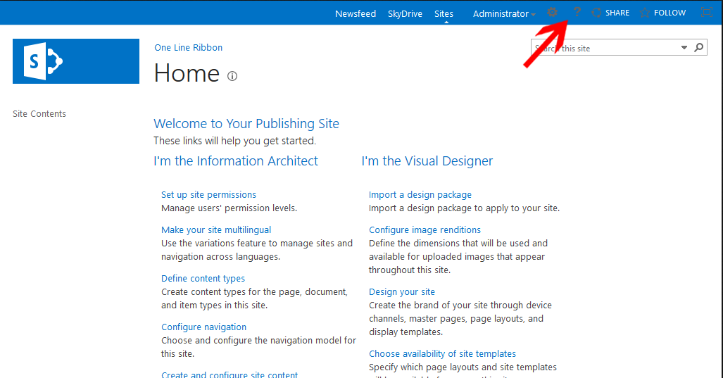
Save everything and the suite bar will disappear and its components are now in the ribbon.
Notice a problem that I highlighted above? I chose to use the blue background color for the combined ribbon, but the icons for many of the actions appear too dark. These icons could be replaced using CSS and custom icons, but the best method is to use composed looks. I will have to address this preferred method in a later post.
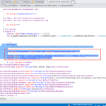
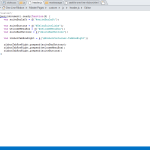
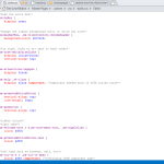
Would you like to see the code samples as they appear in SPD? See below.


This is great but really sucks that it does not work for 2016….
That is an interesting point, I haven’t tried in 2016. The general concept should work though, just a few references to DOM elements would need to be updated. I would be very careful using this technique in SPO though as these types of changes will likely break.
Would like to see this for SP2016
the suite bar CSS may be
div#suiteBarTop {
display: none;
}
Hi Eric,
Thanks for posting this article it is exactly what I need. I am having an issue getting the changes to apply to my read only users. I published the css, js, and masterpage with all the changes. They display for the admins just fine, but when testing it with a read only user the site still shows the suite bar. Any suggestions? Also the read only users have read only rights on the masterpage gallery which stores the css and js files.
I appreciate your help.
Collin
Can you add console.log messages to your js to ensure that it is getting fired for read only users? Are any JS errors being thrown by your read only users? It may also be they are receiving a different ribbon based on security trimming.
My suggestion is to debug your JS code as a read only user by setting breakpoints or my favorite, adding lots of console.log messages.
Wow it worked g8 post
Is it possible to do the same thing on a O365 site? The suite bar and ribbon ids and classes are different.
Marc,
In general the theory is the same so yes. Just be aware that MS may change the ribbon primary div id on you. Most SPO tenants now should have the ribbon / suite bar already combined onto one line though.
MS recommends that we do not modify the ribbon in any way though as they will be making changes and they will be breaking your code. My suggestion then is if you do change anything in the SPO ribbon, be aware that it will break and you might have to jump in and make quick fixes throughout your site’s lifetime.
Eric
hi for me i want to round the border and resize suite bar and ribbon how i can do it pleaz need help!!
You can use the CSS3 style, border-radius to round the border. I suggest looking up border-radius to see exactly how to use it. As for resizing, you mean you want to change the height of the suite bar / ribbon? If so, you can override some height’s, but be aware that it is not a quick fix. Many of the tabs, buttons and links are currently styled around the set ribbon/suite bar heights.
This is absolutely awesome!! So simple as well.
One question. Before i implemented this solution the ribbon bar would still display the everything on the right end of the ribbon bar in both tablet and mobile mode. Now when i view in those displays, everything on the right disappears under a certain width. The only thing that remains constant is the Browse/Page/Publish links on the left end of the ribbon bar. Any tips on this?
thanks again!!
Off hand, I am not sure. I do not see this same behavior but I would have to assume it has to do with the few properties I needed to change to get the divs to float correctly. I would suggest you use Firebug and the Responsive Design View to see if you can find why the ribbon elements are not floating the way you expected them to.