This is part two of my series on modifying the SharePoint 2013 suite bar and ribbon in a safe and SharePoint friendly manner. Part one includes “Collapse the Suite Bar and Ribbon to One Line“. In part two, I am want to address another request I received. A subscriber asked how to hide and show the entire SharePoint 2013 suite bar and ribbon by adding some sort of clickable element such as a solid bar under the ribbon. I suggest an action item that provides more context than a plain bar, but for demonstration purposes a simple bar is more easy to explain.
My strategy is to use a combination of jQuery and CSS to add a simple solid bar under the ribbon. I am going to bind a click event to this bar so that when it is clicked a class is toggled. The presence or absence of this additional class will determine if the suite bar / ribbon should be hidden or not. I want to stay away from using jQuery to manipulate inline styles as I find this hackish and not as clean as styles.
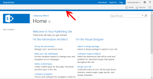
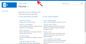
Below you can see how this bar appears under the ribbon and on the right what a page may look like once this bar has been clicked and the suite bar / ribbon has been hidden.
I am going to jump straight into the code as the CSS and jQuery are lean. Please note that I am basing the jQuery and CSS off a copy of the seattle.html HTML Master Page. This is important as I am assuming the following HTML and snippet for the ribbon.
1 2 3 4 | <div id="ms-designer-ribbon"> <!--SID:02 {Ribbon}--> <!--PS: Start of READ-ONLY PREVIEW (do not modify) --><div class="DefaultContentBlock" style="background:rgb(0, 114, 198); color:white; width:100%; padding:8px; height:64px; overflow:hidden;">In true previews of your site, the SharePoint ribbon will be here.</div><!--PE: End of READ-ONLY PREVIEW --> </div> |
What is most important is that there is a wrapper div with ID ms-designer-ribbon and that I am using the SharePoint 2013 <!–SID:02 {Ribbon}–> snippet. If you use a customized ribbon, or rename the ribbon wrapper, you might need to change a few ID’s and classes in the following CSS and jQuery.
The Code:
As I did in part one, I created a custom master page by making a copy of seattle.html, but you could use any custom master page. I then also created a custom CSS and custom JS file. You could add the CSS and JS directly inline in your custom master page, but I prefer to place these types of customization into their own files.
My custom CSS file includes the following CSS. Comments are inline but essentially I am styling a new element, my action bar (#pm-ribbon-toggle-bar) and providing a hover over pointer cursor to simulate a clickable element. I then provide two styles that fix a style bug in OOTB SharePoint and also remove a bottom margin from the status bar that I find distracting. Finally I provide a style which states that when the ribbon wrapper div #ms-designer-ribbon also includes the class .hidden, then the first child div (our suite bar and ribbon) should be hidden.
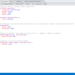
1 2 3 4 5 6 7 8 9 10 11 12 13 14 15 16 17 18 19 20 21 22 23 24 25 26 | /*style our custom, clickable ribbon toggle bar*/ #pm-ribbon-toggle-bar { background: #0072c6 none; display: block; height: 10px; width: 100%; } #pm-ribbon-toggle-bar:hover { cursor: pointer; } /*fix OOTB bug, this box may need to be taller to take into account a ribbon with additional controls*/ #globalNavBox { height: auto; min-height: 35px; } /*Remove the additonal space under the status bar if it appears, tightens up design*/ #pageStatusBar[class], .ms-status-msg { margin-bottom: 0px; } /*requested to hide the suitebar/ribbon*/ #ms-designer-ribbon.hidden > div:first-child { display: none; } |
Now we need to provide the jQuery that will add our bar to the DOM, add a click event, and when the bar is clicked, it will toggle the class .hidden in our ribbon wrapper, #ms-designer-ribbon
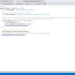
1 2 3 4 5 6 7 8 9 10 11 12 13 14 15 16 17 18 19 20 | /*custom*/ jQuery(document).ready(function($) { var ribbonWrapper = $('#ms-designer-ribbon'); //create a bar that we can show or hide var ribbonToggleBar = $('<div id="pm-ribbon-toggle-bar"></div>'); //bind "click" to this bar, when clicked we will toggle the class "hidden" on the #ms-designer-ribbon selector //Using css, we can then style the ribbon elements to display or hide ribbonToggleBar.bind('click', function(e) { e.preventDefault(); $(this).parent().toggleClass('hidden'); FixRibbonAndWorkspaceDimensions(); }); //finally add our bar to the dom ribbonWrapper.append(ribbonToggleBar); //and make sure to execute OOTB function to have workspace resize FixRibbonAndWorkspaceDimensions(); }) |
Notice an interesting function, FixRibbonAndWorkspaceDimensions(); that I reference twice? This is an OOTB SharePoint function that was also found in previous versions of SharePoint. This function will verify the proper height and width of the #s4-workspace, which is important because each time we add our action bar or hide or show the ribbon, we need the #s4-workspace to resize itself to properly fit the window. 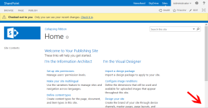 Why reinvent the wheel when SharePoint already provides it. Look to the right if you want to see what would happen if we did not call this function. Notice how the bottom of the scroll bar is missing as the #s4-workspace has been pushed down by our new action ribbon bar.
Finally I will link to these two files (and a jQuery library in case you are not already using jQuery) in the HEAD section of my custom Master Page just as I did in part one. I am using a HTML Master Page, but this could just as easily be added to a unassociated SharePoint Master Page (i.e. non-publishing sites).
1 2 3 |
Now when the a page is loaded, our action bar is placed below the ribbon. When you hover over this bar, the cursor will change to mimic a clickable element, which it is. If you click this bar the suite bar / ribbon disappears but the action bar remains. When you click the bar again, the ribbon will reappear.
There are other methods to hide the ribbon on demand, but I like the KISS method as often as I can. The SharePoint suite bar / ribbon container is flexible enough to account for our modifications with a little help from FixRibbonAndWorkspaceDimensions(). In my next posts I will investigate how we can provide an animated effect and look at replacing the bar with an element that provides a better UX.
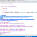
Would you like to see the code samples as they appear in SPD? See below.




Hi Eric,
First of all this is very great article, I was unaware of some of this functions of SharePoint. You make me learn this, thanks a lot.
I have done the same in my custom master page with same approach, but I am facing issue like when I edit the publishing page(ribbon is hidden) and I try to click on Add a Web Part link, ribbon doesn’t show up (that’s okay), but when I open the ribbon, it messed up the whole look of web part gallery, any ideas to overcome this? I have tried fixing this by specifying the heights for DIVs but that didn’t work for me. Would be great if you could help!
Thanks
Pradip
Hi,
That is a good point, if the ribbon is hidden it wouldn’t show even if the ribbon was updated by SP to include the publishing (page) tab, etc. You could add some sort of trigger on your page, looking for updates, but that may be resource intensive.
Regarding your issue with the webpart gallery being messed up, I am not sure what would cause that problem. What in particular is happening? Is the category list showing up ok? How about the columns next to that? Could you provide a screenshot?
Eric
Hi Eric,
Please find a snap here: https://pradiprathod.files.wordpress.com/2015/03/overlappedelements2.png
I have not find anything for this issue. But somewhat I figure out that the categories list is being overlapped by the header. I really appreciate your help.!
Thanks,
Pradip
Hi Eric,
Found a workaround for this issue. I have used EditModePanel control for that publishing page as this blog post: https://pradiprathod.wordpress.com/2015/01/21/how-to-verify-if-the-page-is-in-edit-mode-using-javascript-in-sharepoint-2013/. So when page is in edit mode I do make visible the ribbon control. and the other thing I did it is re-assigned click event for add a web part buttons and opened the ribbon control before Show Web Part Category options. My question for this solution is that, is it feasible option to remove onclick event and then re-assign with extra code before that?
Really appreciate your help!
Thanks,
Pradip
Hi Pradip,
did you find a stable workaround ? I have the same problem, if I hide the ribbon I can’t add webpart anymore on the page it’s look like script are not well load after.
Hi Eric,
Great post! I love improving on the UI of SharePoint, especially since my users want this flexibility. So I attempted to implement your solution in my SharePoint 2013 site in which I have incorporated bootstrap as well. I get the clickable region to hide the Ribbon just fine however; the bar totally disappears after doing so and the only way I can get it back is to refresh the page.
Any ideas on what could be causing this?
Thank you again for taking the time to educate/help the community!
Regards,
Tim
Hi Tim,
I have a feeling that the CSS used to “hide” the ribbon is actually hiding the entire div with id #ms-designer-ribbon, not just its first child. It sounds as though the “bar” div added in the jQuery block is also being hidden as well.
In these situations, I like to bust out my browser dev toolbar and using the element selector, I look to see what is causing a particular div to hide when it should not be hidden.
Eric
HI Eric,
Thank you for the reply. I am familiar with the dev toolbar as well and rely on it in instances such as this or with CSS conflicts etc.. The ribbonToggleBar is definately getting inserted inside the parent DIV for ms-designer-ribbon. In looking at the js code, the fact that the call for the ribbonToggleBar follows the ms-designer-ribbon, I wold think that it would get nested inside the div tags of ms-designer-ribbon. Unfortunately I can’t seem to separate the two. There isn’t a lot of code to deal with here so I doubt it’s a cut-n-paste issue.. 😉
Let me know if anything else comes to mind.
Thanks again Eric!
Kind Regards,
Tim
Hi Tim,
What you do mean by you are unable to separate the two. Is there a a particular line or lines of the JS/jQuery code you would like me to explain in further detail, or rewrite to help see what is happening?
I wonder if Bootstrap is getting in the way, I did not test that. Bootstrap does like to set the box-sizing to border box for its cols, it is possible this is bleeding into the code provided above. Based on how it looks as though the JS is working for you and the tags are in the right place, I would put my money on a Bootstrap/CSS conflict.
How about applying the code to a seattle.master copy just to see if that works for you. That would help narrow down the problem.
Eric