I want to share with you the right way to update the color palette of SharePoint Online (and SharePoint 2013) out-of-the-box (OOTB) icons, in particular those found in the suite bar and ribbon. Your first inclination may be to break open your favorite developer toolbar, drill into the DOM, find the style that is providing the icon and provide your own overriding style pointing to your customized icon.
This post is part of my series on modifying the SharePoint 2013 suite bar and ribbon in a safe and SharePoint friendly manner.
Part one: “Collapse the Suite Bar and Ribbon to One Line”
Part two: “On Demanding Hiding the Suite Bar and Ribbon”
Part three: “Animated Hiding Ribbon”
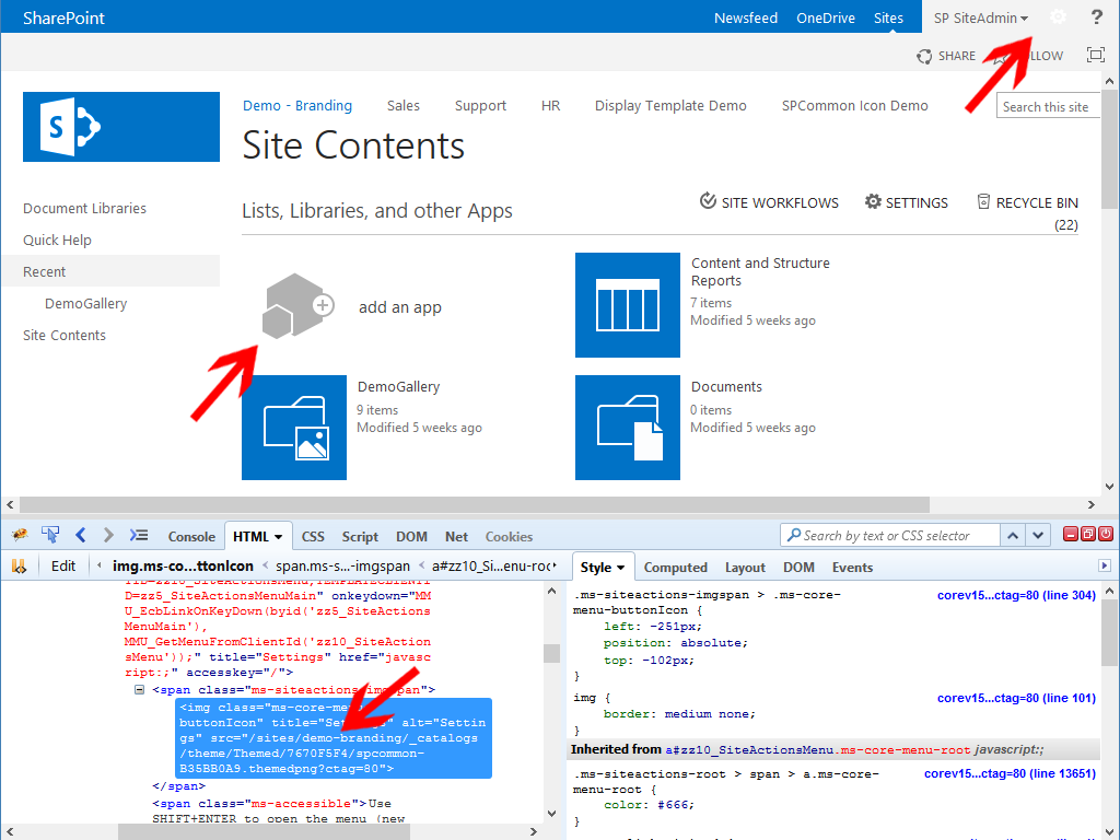
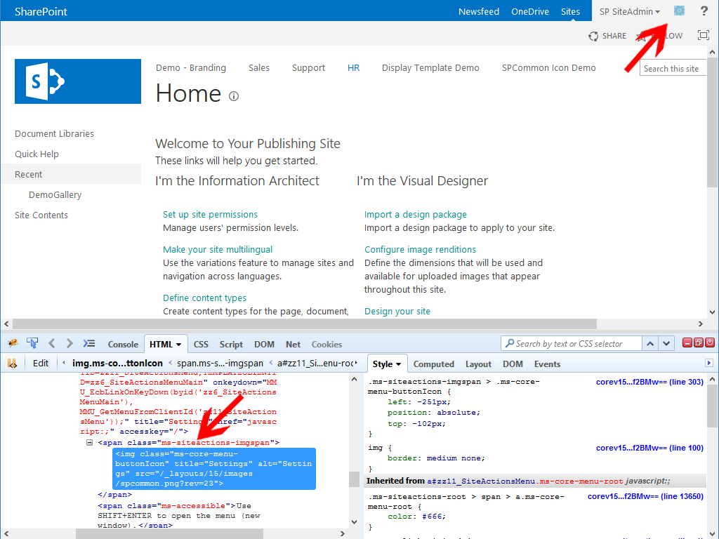 You will find that most OOTB icon styles and image tags point to the sprite /_layouts/15/images/spcommon.png?rev=23. You may be tempted to download this sprite, open it in PhotoShop, edit the icon you want, reupload this to SharePoint and finally provide an updated style to override a particular icon. Microsoft already thought of this and provided us a better way using Composed Looks and the theming engine.
If you want a primer on Composed Looks, I recommend the following post from Benjamin Niaulin, “Step by Step: Create a SharePoint 2013 Composed Look“. I am going to skip Composed Looks in general in this post as for image refactoring, we only care about how the theming engine looks for interesting bits in specific folders. Assuming your interesting bits are correct, SharePoint does a lot of work for us.
In the following walk-through, I am going to replace the gear icon in the suite bar with a gear of a different color, all without updating the master page or linking to a custom stylesheet. Although there are a few steps listed, it is actually very straightforward, I am just being thorough.
Create Interesting Bits
I love this terminology, “interesting bits”. I most recently heard it from Jonathan Keslin and Lionel Robinson at SPC 2014 during their session, “Customizing your SharePoint sites using the SharePoint Theming Engine“. When a Composed Look is applied to a SharePoint site, the theming engine looks in a few folders within the Style Library to see if there is any stylesheets that need to be processed. In particular, the theming engine looks in /Style Library/Themable and /Style Library/{localization}/Themable, i.e. /Style Library/en-us/Themable. Step 1 is to open our SharePoint Online/2013 site in SharePoint Designer (or your favorite tool) and open or create a “Themable” folder in the “Style Library“, i.e. All Files -> Style Library.
Create a stylesheet in the Themable folder, named almost whatever you want. In this case I created a css file, “sprite-theming.css“. Open this file and add the following code.
1 2 3 | /*settings gear - normal*/ /*[RecolorImage(themeColor:"PageBackground", method:"Filling", includeRectangle:{x:251,y:101,width:20,height:18})]*/ background-image: url("/_layouts/15/images/spcommon.png?rev=23"); |
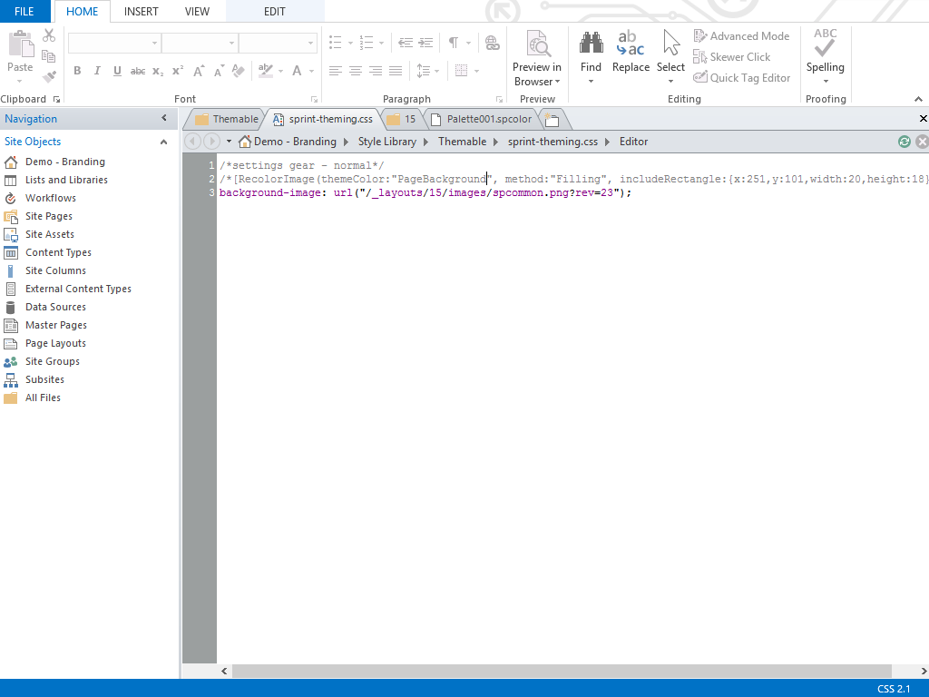 That does not appear to be valid CSS does it? A browser would definitely not like that CSS, but for the theming engine, that is gold. See the theming engine looks for text files in the Themable folders I mentioned above. If it finds anything with special markup, it does what the markup tells it to do, creates updated files and places them in a themed folder. For image recoloring we only care that SharePoint creates a new colored image for us. Save the above css file and I will explain what is going on.
What are Interesting Bits?
Take a look at the 2nd and 3rd lines. In the 2nd line, we are referencing the theming engine’s “RecolorImage” function. This function will recolor an image based on the function parameters. Our first parameter, “themeColor”: “PageBackground”, tells SharePoint we want to use the PageBackground color from the Composed Look’s .spcolor file (found in /_catalogs/theme/15/). The next parameter is telling SharePoint that we want to “Fill” the image with a specific color. Other valid methods include “Tinting” and “Blending”.
Finally we are providing a specific zone or rectangle that we want to limit our “themeColor” “method” to, this way we can control our sprite so that only a specific portion is recolored. This is actually one of the more tricky parts as there are currently 142 sprites within spcommon.png. I will provide a list of all rectangles with their properties shortly and will update this blog post. Anyhow, the includeRectangle function requires a starting x and y coordinate, then the “width” and “height” of the rectangle.
Update
I posted an article that provides a visual breakdown of the different icon locations within the spcommon.png sprite. “SharePoint 2013 spcommon.png Sprite Icons Breakdown”
The 3rd line of our sample css tells SharePoint where to find the image that we want to recolor. It will place the updated image in the particular theme’s folder found in the Master Page Gallery.
What is really cool is that the theming engine will stack image modifications on top previous requests. What I mean by this is that you can request the color change of one particular part of an image and then in another code block, request a different color change for a different rectangle of the same image. SharePoint will combine these changes into one image for you.
Second, if you change elements such as the spcommon.png sprite using this method, then OOTB controls that use this sprite have been designed to honor the theming engine. At least this is what I have repeatedly heard from Microsoft.
Let’s extend my change to sprite-theming.css to the following.
1 2 3 4 5 6 7 | /*add app icon*/ /*[RecolorImage(themeColor:"DisabledText", method:"Filling", includeRectangle:{x:1,y:30,width:97,height:97})]*/ background-image: url("/_layouts/15/images/spcommon.png?rev=23"); /*settings gear - normal*/ /*[RecolorImage(themeColor:"HeaderText", method:"Filling", includeRectangle:{x:251,y:101,width:20,height:18})]*/ background-image: url("/_layouts/15/images/spcommon.png?rev=23"); |
Important!
You must check in and publish a major version of any css file you update and want the theming engine to adhere to.
Second, if you make a change to a themable file, you must reapply the Composed Look before SharePoint will recreate the necessary files.
Applying a Composed Look
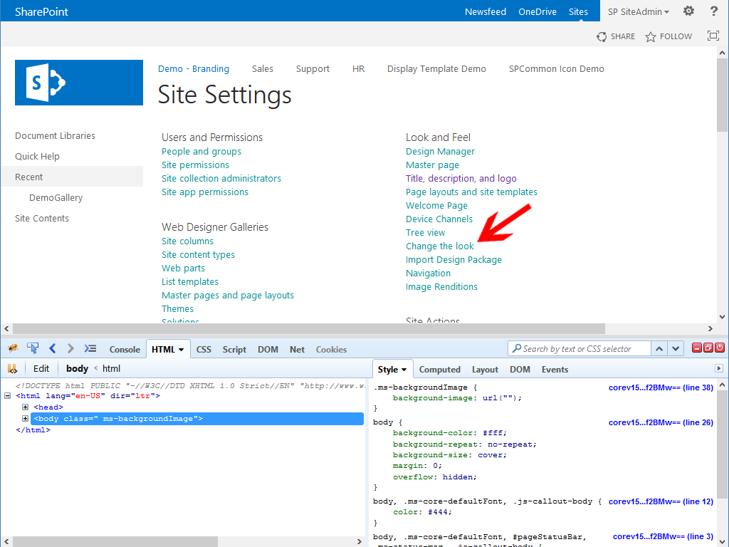
To see our updates sprite, we must now apply our Composed Look.
Visit your site setting page and find “Change the look” under “Look and Feel”.
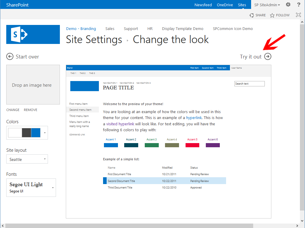
Either select the existing look you wish to reapply, or select a new composed look you wish to apply.
After you “Try it out”, you should see that your sprite was correctly updated and the icons within your sprite changed the color you intended.
What we see above is that the gear in the upper right was recolored to the “HeaderText” color as defined by the “Office” Composed Look, the color white in this case. You can see the location of the new sprite that the theming engine created in the lower left. As I mentioned, SharePoint controls respect the theming engine so the sprite location was updated automatically. In the upper right we can also see that the “add an app” icon was recolored to the Composed Look’s “DisabledText” color, in this case a shade of grey.
What to do if You Run into Problems?
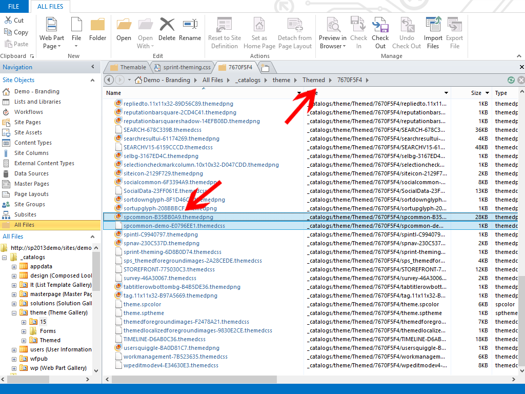 If the sprite does not change the way you thought it would, review your custom css and make sure that the path to your image is correct and that the rectangle is correct. Make sure that the css file has been published. You can also review all of the files the theming engine created for your Composed Look by open All Files -> _catalogs -> theme -> Themed -> “unique, random theme folder”. Check to see if your updated image made it and if so, has it been adjusted the way you thought it would.
Advantages
I find this to be the best method to update OOTB sprites such as spcommon.png for a few reasons. It is actually easier to maintain once you get the hang of it. SharePoint already creates the spcommon.png sprite for you, it is best to update what SharePoint generates so that the client downloads less files. Primarily for me though, many sprites are used in SharePoint controls such as the suite bar and ribbon and Microsoft has committed to updating these controls as they see fit. We branders have to be very careful when using Microsoft provided DOM id’s and classes as they will change. Since Microsoft has committed to respecting theming, I see that as the best path forward.
All in all, Composed Looks and the theming engine provide detailed control over general colors of your site. Even if you are building a fully custom UI, use composed looks to help you recolor OOTB sprites such as spcommon.png.


Hello Eric,
Thanks for this wonderful article.
I’m wondering if we only can recolor the sprite in your image? Is it possible to have the theme engine to recolor/tint any image? For example, the lone icon under “/_layouts/15/images/SharePointFoundation16.png?rev=23” ?
Thanks.
Thanks. Yes, you can use the same technique to recolor most any image that is set as the background-image so it can be referenced via CSS and I believe the image will need to be local to the web/site in question.
Awesome post!
Firstly this is a fantastic article, never knew this was possible and is very powerful. I am working on a large project by which branding will be deployed via design packages and have 2 questions
1. Will the CSS files in the style library be included in this design package or will I need to add them to each site collection (25 so far ;-0!)
2. If I have a composed look already added can I just add the CSS or do I need to re-apply the composed look again?
Hi Stephen,
If you create a design package, then custom files in the style library should also be included in the design package. Do we careful with Design Packages. Once you install a design package, you should never uninstall it. It is a limitation of Design Packages. I still prefer to create my own branding solutions using Visual Studio.
Regarding question 2, once you apply a composed look, SharePoint creates a new set of base CSS files for you. You can always create your own additional stylesheet(s) and link to them in your custom master page, or setting one as your alternative CSS. You should only have to reapply your composed look if you update your spcolor or spfont file, or you want to update a particular sprite image.
Eric
Hi Eric,
Do you think you could replace a sprite altogether rather than just coloring using this method?
Glenn.
What do you mean by replace? You could recolor the entire sprite, and a new sprite will be created that you could reference.![]() tag, though more difficult to replace using only CSS.
tag, though more difficult to replace using only CSS.
Or yes, you could create your entirely new sprint with your own image components and then update css to use this sprite throughout your site, but some of the areas where the sprite is used references the sprite in an
Eric